















Information should be clear.
Dark text / light background#000F1E / #F8F8F818.19:1 · Meets the AA threshold for normal text
A shared language for our identity.
PMH’s visual identity achieves cohesion through its logo, colour scheme, typography and consistent application. This page brings together the basic guidelines and up-to-date files for the correct use of our brand.
Logo and emblem
The horizontal logo is our primary logo. The emblem is used in narrow spaces where the PMH name is already visible, or in profile images. The boxed variations are intended for applications where the logo needs to stand out from the background.
 PMH · Main logo
All logo and emblem variations 16















The brand name is written as PMH. The full trading name is used in areas where official company details are required: Periyodik Muayene Hizmetleri Ticaret Anonim Şirketi.
Leave space for visibility.
Maintain the logo’s geometry and the relationship between the emblem and the text. Use the ready-made file in every application.
x/2
x = the height of the emblem
Clear space
Leave at least x/2 of clear space on all four sides of the logo. Keep this area free of text, borders and other marks.
Minimum usage
Horizontal logo: at least 120 px wide on screen or 30 mm wide in print. Emblem: at least 24 px high on screen or 6 mm high in print.
These are minimum sizes for standard screen display and flat printing. Use a larger size for embroidery, cut vinyl and textured surfaces, verified with a production sample.
Do not use the white logo on a light background or the black logo on a dark background. Do not add any new colours, text or accreditation marks to the main logo.
Our colours
Blue highlight; used in conjunction with dark navy blue and light backgrounds. Secondary colours support the visual hierarchy and information flow without overshadowing the primary palette.
Text and background pairings
Information should be clear.
White text / dark background#FFFFFF / #000F1E19.32:1 · Meets the AA threshold for normal textInformation should be clear.
White text / blue background#FFFFFF / #0078D64.51:1 · Meets the AA threshold for normal textInformation should be clear.
Dark grey / Memphis#333333 / #E6E0D79.63:1 · Meets the AA threshold for normal textRatios are calculated for solid, opaque sRGB colours. The same result cannot be assumed over photographs.
The codes are sRGB / HEX values for digital use. White (#FFFFFF) and solid black (#000000) form part of the relevant logo files. CMYK and spot colour equivalents are determined via the print profile and physical sample.
Neue Haas Grotesk
The ‘Display’ family is used for headings, whilst the ‘Text’ family is used for long blocks of text. A clear reading hierarchy is established using the Regular, Medium and Bold weights.
Technical information.
Clear communication.
Neue Haas Grotesk
Display
Information,
at first glance.
Headings, covers and short messages. Creates a clear reading order at larger sizes.
Text
PMH describes periodic inspection services simply, clearly and consistently. The heading introduces the subject; the paragraph provides the detail.
Long-form text, report descriptions, tables and compact information areas.
Three weights, a clear hierarchy.
Roman / 400Paragraphs and captions
Technical knowledge. Clear communication.
Medium / 500Subheadings and labels
Technical knowledge. Clear communication.
Bold / 700Key messages and selected emphasis
Technical knowledge. Clear communication.
Web type hierarchy
Read font size and line height together. These examples use the site's shared typography styles.
A shared language for our identity.
Page heading · Display600 CSS → Bold 700Desktop: 52 / 55.12 pxMobile: 38 / 41.04 pxLetter spacing: 0
Technical knowledge, clear communication.
Section heading · DisplayMedium 500Desktop: 34 / 38.76 pxMobile: 30 / 34.50 pxLetter spacing: −0.015 em
Inspection and reporting
Subheading · DisplayMedium 500Desktop: 26 / 31.20 pxMobile: 22 / 27.50 pxLetter spacing: 0
We explain the inspection process clearly, simply and consistently.
Body text · TextRoman 400Desktop: 16 / 24.80 pxMobile: 15 / 23.25 pxLetter spacing: 0
Application example. Data is illustrative.
Caption · TextRoman 400Desktop: 13 / 18.85 pxMobile: 12 / 17.40 pxLetter spacing: 0
Font size / line height. Mobile values apply at 760 px and below. The page heading's CSS weight of 600 uses the available Bold font; there is no separate Semibold file.
Turkish characters and technical notation
Çç Ğğ İi Iı Öö Şş Üü
0123456789
+ − ± × = / % & ( ) : ;
25 mm7.5 kW20 °C120 m²
Character and unit examples; these are not measurement results or declarations of conformity.
Choices that improve readability
Line spacing
Recommended
State the inspection scope clearly. Share details in short, readable paragraphs.
Avoid: excessive line spacing
State the inspection scope clearly. Share details in short, readable paragraphs.
Letter spacing
Recommended
Periodic inspection
Avoid: compressed letters
Periodic inspection
Heading line breaks
Recommended
Technical information.
Clear communication.
Avoid: splitting the message
Technical knowledge. Clear
communication.
Emphasis
Recommended
Every report contains clear and traceable information.
Avoid: competing emphasis
Every report contains clear and traceable information.
One typeface, different roles.
Application example
Inspection report
Measurement records
| Field | Value |
|---|---|
| Length | 25 mm |
| Temperature | 20 °C |
PMH
Service
proposal
Scope. Process. Delivery.
Application examplePeriodic inspection
Plan your
inspection.
pmh.net.tr
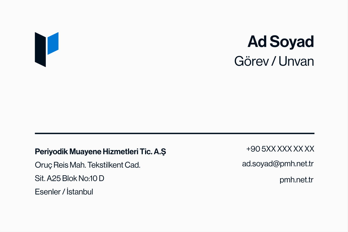
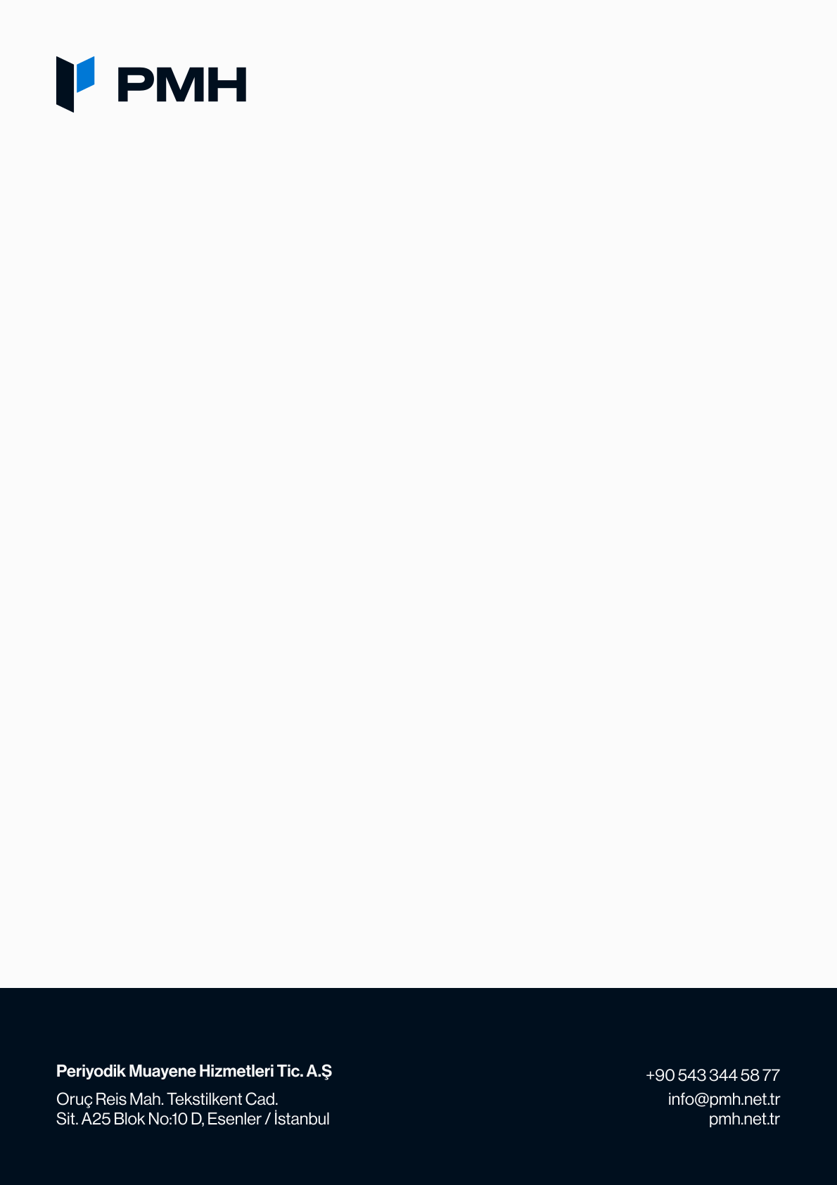
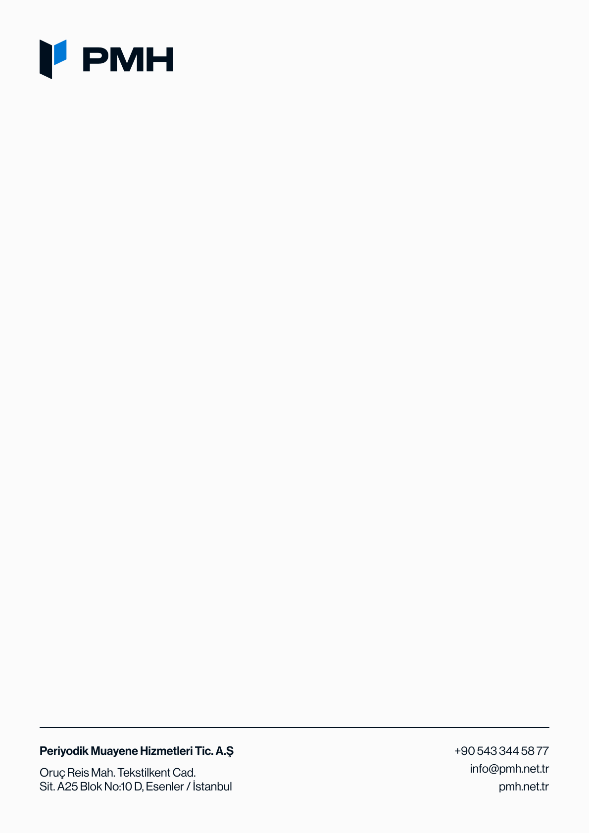
Application exampleDocuments and email
For A4 documents, use 28/32 pt headings, 16/20 pt subheadings, 10.5/15 pt body text and 9/12 pt captions.
Where the brand font is unavailable, use the Arial, Helvetica, sans-serif fallback. Font files are not included in the logo package.
Inspection planning
Hello,
Thank you for your enquiry. We will share the inspection scope and planning details with you.
PMH
info@pmh.net.tr
A pattern derived from our emblem.
Used on covers, documents and large surfaces. No small text or logos are placed over the design; the information area is kept simple.
The same brand identity at every touchpoint.
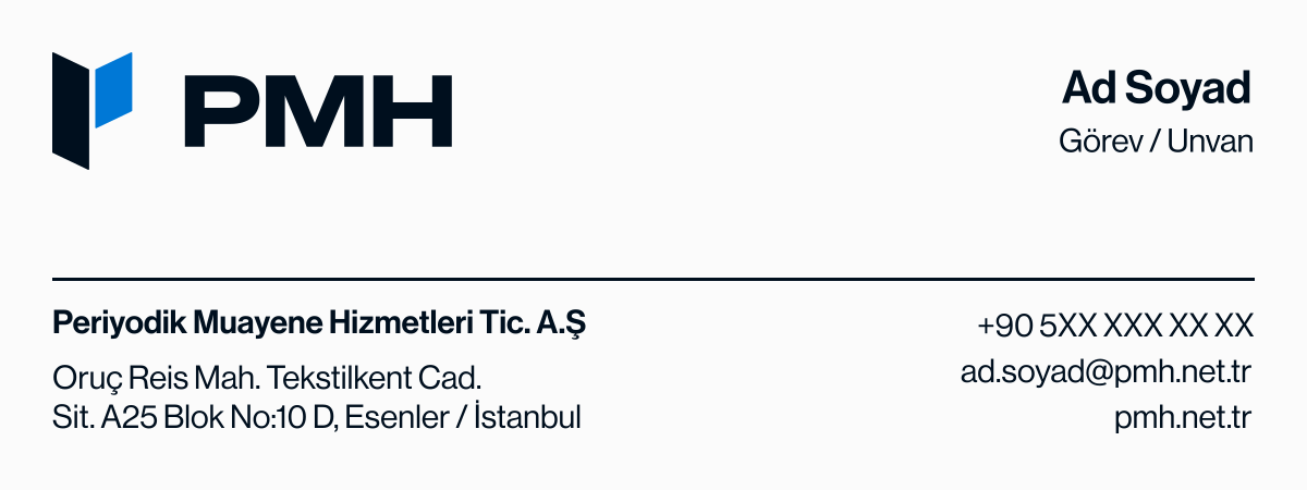
Business cards, letterheads and email signatures share the same logo, colour scheme and typography. The areas for the person’s details in the images are for illustrative purposes only.
16 application examples
Document set
Report and proposal layouts presented together.
Application exampleReport cover
A4 · example fields for customer and report details.
Application exampleReport inner page
A4 · records table, photograph and description layout.
Application exampleProposal cover
A4 · scope, process and delivery details.
Application exampleProposal inner page
A4 · sample scope and pricing table.
Application exampleCorporate presentation
Eight slides · 1920 × 1080.
Application examplePresentation slides
Cover, company, services, process, table, photography, section divider and contact.
Application exampleSocial media applications
A shared visual language for announcements, services and technical information.
Application exampleAnnouncement
1080 × 1350 · portrait post.
Application exampleService introduction
1200 × 627 · landscape post.
Application exampleTechnical information
1080 × 1350 · a readable information layout.
Application examplePolo shirt and vest
Front and back logo placements. A sample is required before production.
Application exampleSafety helmet
Front and side logo placements. Review the product and application surface with the manufacturer.
Application exampleService vehicle
Side and rear applications for a light commercial vehicle.
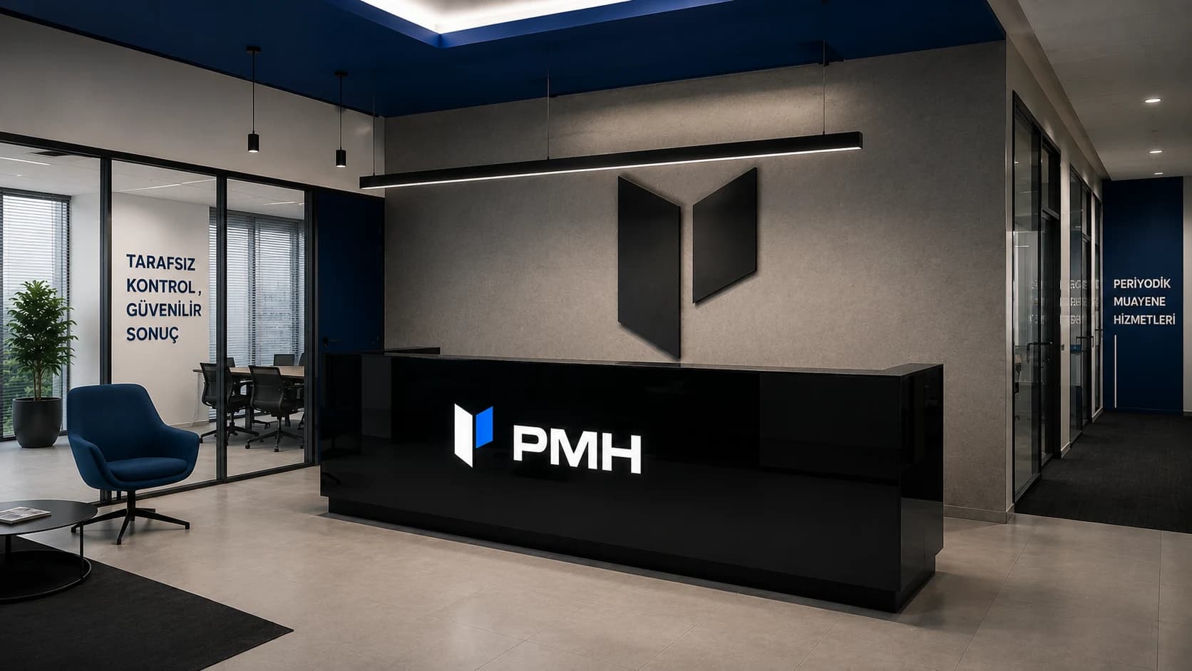
Application exampleLogo wall
Dimensional logo with a restrained material palette.
Application exampleWayfinding and information sign
Clear indoor wayfinding and company identification.
Application examplePhotography
Use natural light, simple framing and a clear focus to reveal technical detail. Leave a quiet area for text; avoid placing dense information over photographs.
Voice and tone
Use short, specific and technically clear sentences. Prefer verifiable statements such as “We clearly report the inspection scope and findings” to absolute promises such as “Perfect assurance”.
The interiors, vehicles and products shown are design concepts, rather than depictions of actual offices, fleets or finished production. Customer, pricing and measurement fields in the documents are illustrative.

Current brand files
Select the correct variation and share the usage guidelines along with the file.
PDF · Turkish · A4 landscape
Corporate identity guidelines
Logo, colour, typography and application guidelines.
Download PDF ZIP · SVG + PNGPMH logo package
Logo and emblem variations, transparent PNG files and usage guidelines.
Download the logo packVersion 1.1 · September 2026 · 29 pages. For questions about brand use, contact info@pmh.net.tr.